In this post, we are going to create a button in the header of an Ext JS grid action column.
The facts
In order to display and manipulate large sets of data, there is a UI scheme that is often used by us developers: a grid to display the data, bound to a form to add or edit records.
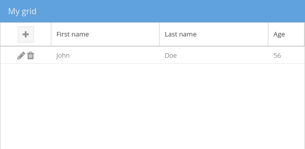
There are several ways of doing this. For example, a toolbar above or beneath the grid:
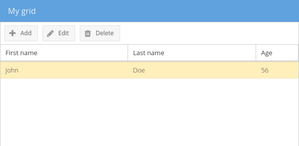
What we are going to study here, is a completely integrated UI solution. It will include a button inside an action column header. While the cells of that column will contain the edition and deletion action icons.
That way you will have a lean and modern design, compared to the previous UI.
The issue
Ext JS grid columns already have the capability of having items in their the header via the items config :
The issue here is that this way of doing it will not work for action columns xtype: 'actioncolumn'
Indeed, the items property for that kind of column is meant to set their cells icons configuration.
The solutions
Use a template column
The first solution would be to use a templatecolumn. This type of column easily helps us displaying an Ext JS template inside its cells.
In this case, it would really be straightforward to create the tags displaying those icons via a HTML template. The troubles we would have to face with the itemsconfig of an actioncolumn would then disappear:
Nevertheless, it might become painful to handle click on each icon individually, the icons enabled/disabled state or let them have their own tooltip all along the grid rows.
The actioncolumn component, via isActionDisabled, handler() or getTip(), facilitates those kind of interactions in a dynamic way. To get to this, you would have to manually code those different behaviours for a column of type templatecolumn.
Create a plugin for the action column
The second solution, which is cleaner and more modular, would be to create a plugin that may be applied to any actioncolumnof our application. This plugin will be provide a way to configure a button located in the header.
As a consequence we will keep all the features of the default actioncolumnwhile getting to the expected result.
How to create the plugin
An Ext JS class which extends Ext.AbstractPlugin:
The alias will let us easily identify the plugin we want to add later to our column.
We give it a property to also identify our button’s container inside the target column header.
Finally, we create a button configuration which will be implemented when we declare our plugin on the column.
How to initialize it
As for any plugin, by overriding the abstract function init(), we can get the component on which the plugin is set and interact with it.
We link the plugin to the component on which it is set.
Then, we listen to the viewready event of the grid. (We will talk later about what is happenning when this event is fired).
Then we create a unique identifier based on the id of the column itself.
And finally, we inject a HTML block having the identifier created earlier as its id, inside the header of the column. That way we will easily have access to it among the different functions exposed by the plugin.
Below the complete code of our plugin init() function:
Let’s add our button at the creation time of the grid
Once the grid is rendered, it fires a viewready event, which we make our plugin listen to.
When this event is fired, we create the button from the buttonConfig we set previously:
Then we just inject this component inside the container we added at the plugin initialization:
The complete code of our onViewReady() function:
Let’s set the plugin of our column
This way, we will be able to have access to every property and function available for the differents items of the actioncolumn, while setting a button in its header.
You can get the whole (and a bit adjusted) code and its result by going to this fiddle.